Plane Crash Data - Part 3: Visualisation
In Part 1 and Part 2 of this series, we scraped plane crash data from the web and complemented it with the geo coordinates of departure, crash and intended arrival location. In this third part, we will visualise the data on a map using the leaflet package.
library("leaflet")
library("geosphere")
Again we keep only complete rows of the data:
data <- data[complete.cases(data), ]
Let us first prepare a color palette with three different shades of red. We will need it later on.
pal <- colorNumeric(palette = c("#ffe6e6", "#ff8080", "#ff0000"),
                    domain = c(0, 100))
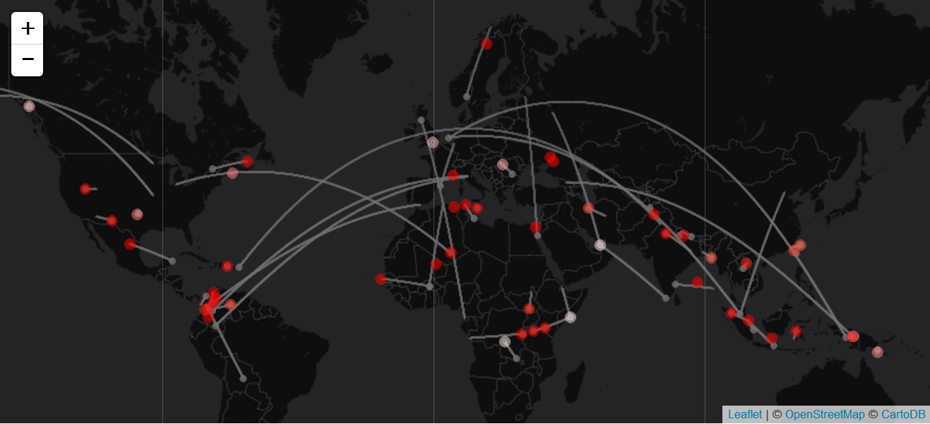
In order to visualise the flight route between departure and destination, we create geo coordinates of the way in between. This can be done with the function gcIntermediate from the geosphere package. To decide how many points we should create, we first need a measure of the distance between the two locations. The higher the distance, the more dots we will need for the visualisation.
# distance between from and to location
data %<>% mutate(dist = abs(latFrom - latTo) + abs(lngFrom - lngTo))

# create many geocoordinates between "from" and "to"
geoLines <- lapply(seq(nrow(data)),
                   function(i) {
                     gcIntermediate(c(data$lngFrom[i], data$latFrom[i]),
                                    c(data$lngTo[i], data$latTo[i]),
                                    n = 10 * data$dist[i],
                                    addStartEnd = TRUE,
                                    breakAtDateLine = TRUE) %>%
                       as.data.frame %>%
                       setNames(c("lng", "lat"))
                     }) %>% bind_rows
}
Now everything is ready to create a map with the leaflet function:
# empty plot
leaflet(data, width = "100%") %>%

  # add map
  addProviderTiles("CartoDB.DarkMatterNoLabels") %>%

  # change displayed section
  setView(10, 35, zoom = 2) %>%

  # add flight routes
  addCircles(lng = geoLines$lng,
             lat = geoLines$lat,
             col = "#6E6E6E",
             radius = 1,
             opacity = .05,
             weight = 1) %>%

  # add a slightly larger dot for the departure location
  addCircleMarkers(~lngFrom,
                   ~latFrom,
                   color = "#6E6E6E",
                   radius = 1,
                   opacity = 0.8) %>%

  # mark crash locations; the color reflects the share of victims
  addCircleMarkers(~lngCrashLoc,
                   ~latCrashLoc,
                   color = ~pal(deathRate),
                   radius = 3)