Data Visualization in R vs. Python
A decisive step in the data science process is communicating the results of your analysis. As a data scientist, you are often tasked with presenting these results to people with little or no statistical background, making it important to be able to present the content clearly and understandably.
It is often also useful to begin a data science project by creating simple graphs to explore the data, before the actual analysis.
Tools for visualization can be found in both R and Python, with some key differences between the two. If you’re looking to determine which language is right for you and your projects, this article might be interesting for you.
This article covers specific differences between R and Python in terms of data visualization.
Visualization in R
The graphics Package for Data Exploration
R provides some basic packages that are installed by default. This includes the graphics package, which contains about 100 functions to create traditional plots. These very simple generic functions allow you to quickly create simple images such as scatterplots, boxplots, and histograms. This comes in handy for speedy data exploration.
For example, if we apply the plot() function to the iris dataset, we see a matrix of scatterplots corresponding to a correlation matrix of all of the columns. This is useful for getting a simple overview of the relationships between the variables.
plot(iris)
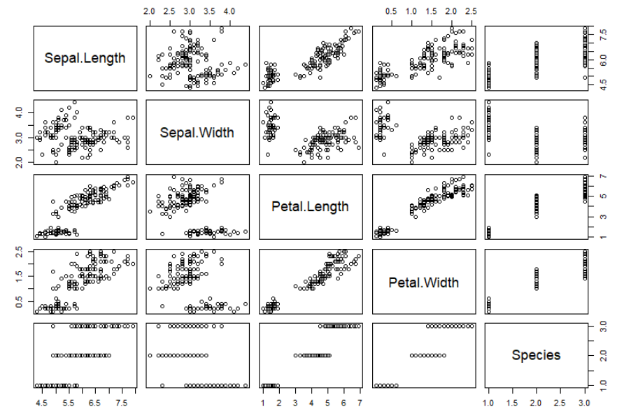
For example, here we can see that the variables Petal.Length and Petal.Width are positively correlated with each other.
Visualization with R Package ggplot2
Besides the generic plotting functions, R also offers numerous libraries such as ggplot2, lattice, and plotly, which can create different types of plots, improve their appearance, or even make them interactive.
In particular, ggplot2 and data visualization in R go hand-in-hand. With ggplot2, R offers an elegant and versatile system for creating plots, following a layered approach that allows you to create plots step-by-step: starting with the data, then adding “aesthetics” (such as axes and the position of the data points on the plot), and style elements like lines, scales, or confidence intervals. This “Grammar of Graphics” philosophy, where objects are added to the plot in layers, allows a relatively simple and intuitive creation of images.
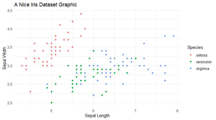
Creating a simple plot based on the iris dataset illustrates this philosophy. First, we create the basic structure of our graph, which contains the data and the axes. The grouping variable “Species” is also specified here. In the next step, data points are added. Finally, we add a title, change the axis labels, and customize the background.
ggplot(iris, aes(x = Sepal.Length, y = Sepal.Width, col = Species)) +
  geom_point() +
  labs(title = "A Nice Iris Dataset Graphic", x = "Sepal Length", y = "Sepal Width") +
  theme_minimal()
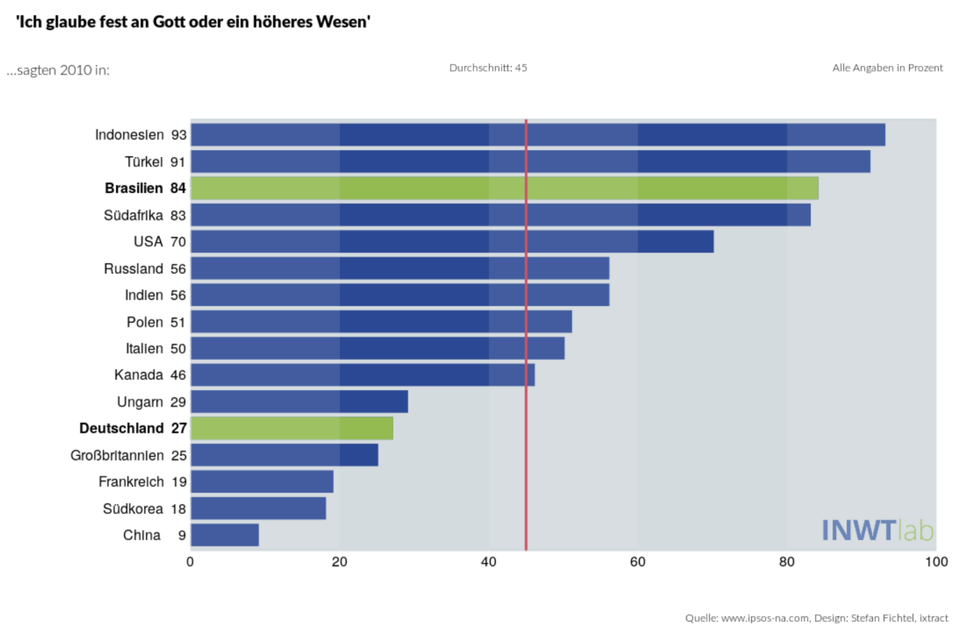
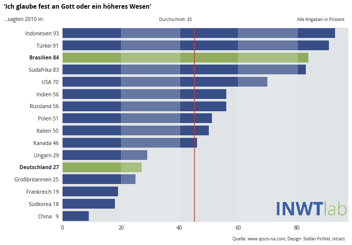
Of course, R can also be used to create much more elaborate plots. The plot below is a good example. It's taken from our (German) blog post "Ein nicht ganz so einfaches Balkendiagramm mit ggplot2". To run the following example, the path to a logo and the ipsos.xlsx data set must be adjusted. The data set can be downloaded via http://extras.springer.com/Zip/2018/978-3-662-54819-6.zip
# devtools::install_github("INWTlab/ggCorpIdent")
library(ggCorpIdent)

ggCorpIdent(base_family = "Open Sans",
            textColor = "#000000",
            colors = c("#2B4894", "#cd5364", "#93BB51"),
            logo = "path/to/logo.png",
            logoSize = 0.1,
            logoTransparency = 0.8)

ipsos <- openxlsx::read.xlsx("path/to/ipsos.xlsx")
ipsos <- ipsos[order(ipsos$Wert),]
ipsos$Land <- ordered(ipsos$Land, ipsos$Land)
ipsos$textFamily <- ifelse(ipsos$Land %in% c("Deutschland","Brasilien"),
                           "bold", "plain")
ipsos$labels <- paste0(ipsos$Land, ifelse(ipsos$Wert < 10, "     ", "  "),
                       ipsos$Wert)
rect <- data.frame(
  ymin = seq(0, 80, 20),
  ymax = seq(20, 100, 20),
  xmin = 0.5, xmax = 16.5,
  colour = rep(c(grDevices::rgb(241, 243, 244,30,maxColorValue=255),
                 grDevices::rgb(241, 243, 244,0,maxColorValue=255)),
               length.out = 5))


ggBar <- ggplot(ipsos) +
  geom_bar(aes(x = Land, y = Wert), stat = "identity", width=.75) +
  geom_bar(aes(x = Land, y = ifelse(Land %in% c("Brasilien", "Deutschland"), Wert, NA)),
           stat = "identity", fill = "#93BB51", color = "#93BB51", width=.75) +
  geom_rect(data = rect,
            mapping = aes(ymin = ymin, ymax = ymax,
                          xmin = xmin, xmax = xmax),
            fill = rect$colour,
            color = grDevices::rgb(241, 243, 244,0,maxColorValue=255)) +
  geom_hline(aes(yintercept = 45), colour =  "#cd5364", size = 1) +
  scale_y_continuous(breaks = seq(0, 100, 20), limits = c(0, 100), expand = c(0, 0)) +
  scale_x_discrete(labels = ipsos$labels) +
  coord_flip() +
  labs(y = NULL,
       x = NULL,
       title = NULL) +
  theme(panel.grid.minor = element_blank(),
        panel.grid.major = element_blank(),
        axis.text.y = element_text(
          face = ipsos$textFamily, hjust=0.99,vjust=0.5))

ggBar

library("grid")

vp_make <- function(x, y, w, h)
  viewport(x = x, y = y, width = w, height = h, just = c("left", "bottom"))

main <- vp_make(0.05, 0.05, 0.9, 0.8)
title <- vp_make(0, 0.9, 0.6, 0.1)
subtitle <- vp_make(0, 0.85, 0.4, 0.05)
footnote <- vp_make(0.55, 0, 0.4, 0.05)
annotation1 <- vp_make(0.7, 0.85, 0.225, 0.05)
annotation2 <- vp_make(0.4, 0.85, 0.13, 0.05)

grid.newpage()
print(ggBar, vp = main)

grid.text("'Ich glaube fest an Gott oder ein höheres Wesen'",
          gp = gpar(fontfamily = "Lato Black", fontsize = 14),
          just = "left", x = 0.05, vp = title)

grid.text("...sagten 2010 in:",
          gp = gpar(fontfamily = "Lato Light", fontsize = 12),
          just = "left",
          x = 0.05, vp = subtitle)

grid.text("Quelle: www.ipsos-na.com, Design: Stefan Fichtel, ixtract",
          gp = gpar(fontfamily = "Lato Light", fontsize = 9),
          just = "right",
          x = 0.95, vp = footnote)

grid.text("Alle Angaben in Prozent",
          gp = gpar(fontfamily = "Lato Light", fontsize = 9),
          just = "right",
          x = 1, y = 0.55, vp = annotation1)

grid.text("Durchschnitt: 45",
          gp = gpar(fontfamily = "Lato Light", fontsize = 9),
          just = "right",
          x = 0.95, y = 0.55, vp = annotation2)
Visualization in Python
Unlike R, Python – as a “general-purpose” programming language - does not include data visualization tools by default. However, Python also provides many libraries for this purpose, such as Matplotlib and Seaborn.
Python now also offers numerous packages (like plotnine and ggpy) which are equivalents of ggplot2 in R, and allow you to create plots in Python according to the same “Grammar of Graphics” principle.
Visualization in Python: Matplotlib
The most commonly used library for data visualization in Python is Matplotlib. Matplotlib is based on NumPy arrays, and was originally designed as a Python alternative to Matlab, which is reflected in much of the syntax.
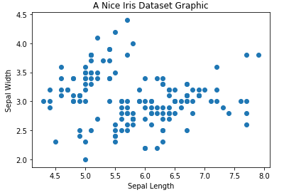
A scatterplot with graphic title and axis label - similar to the R example - can be created with Matplotlib using the scatter() function.
import pandas as pd
import matplotlib.pyplot as plt

iris = pd.read_csv('iris.csv')
plt.scatter(x = 'SepalLengthCm', y = 'SepalWidthCm', data = iris)
plt.title('A Nice Iris Dataset Graphic')
plt.xlabel('Sepal Length')
plt.ylabel('Sepal Width')
Visualization in Python: Seaborn
We can see that in the example above, no color distinction is made between the different iris species. To add this, or a legend (which is also missing in this plot), requires some effort in Matplotlib. We can use a different library, Seaborn, as an extension of Matplotlib to allow for comparatively simpler plot creation. For example, to add the species colors and the legend in Seaborn, we only need this straight-forward solution:
import seaborn as sns
sns.scatterplot(x = 'SepalLengthCm', y = 'SepalWidthCm', hue = 'Species', data = iris)
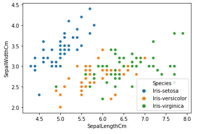
We can also use Seaborn to see an initial overview of the data within the framework of data exploration. For example, we can use the pairplot() function:
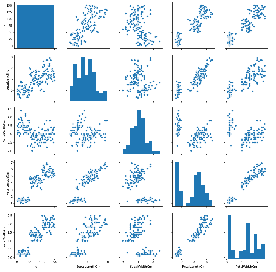
We can see a similar figure to the original one we made with the R graphics package, which shows a first impression of the relationship of the variables to one another.
More elaborate plots can also be created in Python. For illustration purposes, we’ve recreated the plot from the R example. One thing to note is that the code is much shorter to create the same plot with Seaborn in Python than it was with ggplot2 in R.
import pandas as pd
import seaborn as sns
import matplotlib.patches as patches
import matplotlib.pyplot as plt

df = pd.read_excel(r'Downloads/ipsos.xlsx')
df['Land_Wert'] = df['Land'] + ['   ' if len(str(x)) < 2 else ' ' for x in df.Wert ] + df['Wert'].map(str)

sns.set_style("white", {"axes.facecolor": "#E0E4E6",
                       "axes.edgecolor": "1",
                       "patch.force_edgecolor": False,
                       "font.family": "Open Sans"})

barcolor = ["#93bb51" if (x == "Brasilien" or x == "Deutschland") else "#2B4894" for x in df.Land]
plt.figure(figsize=(10,7))
fig, p = plt.subplots(figsize=(10, 7))
p = sns.barplot(x = df.Wert, y = df.Land_Wert, palette = barcolor)
p.set_ylabel('')
p.set_xlabel('')
p.axvline(45, color = "#bc423a")
p.add_patch(patches.Rectangle((20, -1), 20, 20, color = "#f1f3f4", alpha = .25))
p.add_patch(patches.Rectangle((60, -1), 20, 20, color = "#f1f3f4", alpha = .25))
p.text(-20, -2, "'Ich glaube fest an Gott oder ein höheres Wesen'",
       horizontalalignment='left', size='large', color='black', weight='bold')
p.text(-20, -1, "...sagten 2010 in:")
p.text(33, -1, "Durchschnitt: 45", size = "small")
p.text(80, -1, "Alle Angaben in Prozent", size = "small")
p.text(58, 17, "Quelle: www.ipsos-na.com, Design: Stefan Fichtel, ixtract", size = "small")
p.get_yticklabels()[2].set_fontweight("bold")
p.get_yticklabels()[11].set_fontweight("bold")
im = plt.imread('path/to/logo.png')
newax = fig.add_axes([.7, 0.125, 0.2, 0.2], anchor='SE', zorder = 1)
newax.imshow(im)
newax.axis('off')
Summary
Overall, both R and Python are well-equipped for data visualization. R is a language primarily for data analysis, which is manifested in the fact that it provides a variety of packages that are designed for scientific visualization. Python, on the other hand, is a general-purpose programming language that can also be used for data analysis, and offers many good solutions for data visualization.
Customizing graphics is easier and more intuitive in R with the help of ggplot2 than in Python with Matplotlib. The Seaborn library helps to overcome this, and offers good standard solutions which get by with relatively few lines of code. Our example clearly shows that Seaborn can often accomplish similar plots to ggplot2, but with less code.
Overall, there is some disagreement as to which programming language can be used to create plots more efficiently, clearly, and intuitively. We were also not able to come to a decisive conclusion on this point.
Essentially, the decision between R and Python should consider the programming-language preferences and experiences of the user. Ultimately, both languages offer the possibility to visualize data in a clear and appealing manner.
Perhaps you know specific use cases where you think one language is better suited, or think there are specific advantages and disadvantages for one of them in terms of data visualization? Feel free to contact us and let us know your thoughts!